MENU
CLOSE
[1]
Project
PolicySafe
[2]
Client
PolicySafe
Project type
Mobile App Design
Industry
Insurance · FinTech
Year
2023
About project
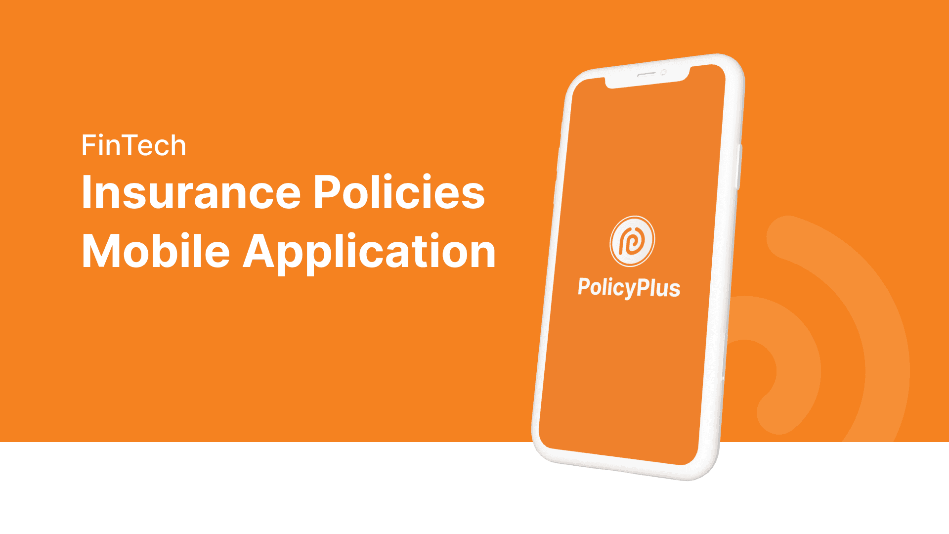
PolicySafe is a mobile app concept for managing all personal insurance policies health, vehicle, life, and home in one place, with renewal reminders, claim tracking, and a document vault. The starting point was a simple observation: India has over five hundred million insurance policyholders and most of them have no idea where their policy documents actually are. Not because they are careless because the tools to manage this simply do not exist in any usable form. Ask most people to pull up their health insurance policy document right now and watch what happens. It is in an email from three years ago, or a PDF on a laptop they switched from last year, or a WhatsApp message from the LIC agent buried under four hundred family group messages. I spoke informally to four people in my network who have multiple insurance policies. Nobody knew exactly how many active policies they had without thinking about it for a moment. At least two had missed a renewal at some point because the reminder went to spam. None of them felt confident about what their policies actually covered. This is not a financial literacy problem. It is a design problem and that distinction was the foundation of the entire brief.
PolicySafe is a mobile app concept for managing all personal insurance policies health, vehicle, life, and home in one place, with renewal reminders, claim tracking, and a document vault. The starting point was a simple observation: India has over five hundred million insurance policyholders and most of them have no idea where their policy documents actually are. Not because they are careless because the tools to manage this simply do not exist in any usable form. Ask most people to pull up their health insurance policy document right now and watch what happens. It is in an email from three years ago, or a PDF on a laptop they switched from last year, or a WhatsApp message from the LIC agent buried under four hundred family group messages. I spoke informally to four people in my network who have multiple insurance policies. Nobody knew exactly how many active policies they had without thinking about it for a moment. At least two had missed a renewal at some point because the reminder went to spam. None of them felt confident about what their policies actually covered. This is not a financial literacy problem. It is a design problem and that distinction was the foundation of the entire brief.


[3]
What I did
I designed the complete mobile UI from persona development and user journey mapping through to high-fidelity screens and component documentation in Figma. The hardest part of this project was not the information architecture it was the emotional context. People open an insurance app when something has gone wrong or they are worried something might go wrong. They are already stressed. The design needed to reduce that stress, not add to it. Every decision the calm colour palette of trustworthy blue with warm amber used only for genuine urgency signals, the minimal navigation, the plain language in every text field was an answer to the same question: how do we make someone feel less anxious in a moment when they are already anxious. Five features were designed to address the specific problems found in research: a policy dashboard with colour-coded status cards so you know where you stand before reading a single word, a three-stage renewal reminder system at thirty days, seven days, and one day before expiry across push notification and SMS because one reminder that goes to spam is not a reminder, a What's Covered section per policy written in plain language with no jargon, a four-step claim tracker with document upload at each stage, and an offline document vault because you will need your insurance card at eleven at night in a hospital where the wifi is terrible. Navigation was designed to reach any feature within two taps from the dashboard a constraint set before any screen was designed and held all the way through.
I designed the complete mobile UI from persona development and user journey mapping through to high-fidelity screens and component documentation in Figma. The hardest part of this project was not the information architecture it was the emotional context. People open an insurance app when something has gone wrong or they are worried something might go wrong. They are already stressed. The design needed to reduce that stress, not add to it. Every decision the calm colour palette of trustworthy blue with warm amber used only for genuine urgency signals, the minimal navigation, the plain language in every text field was an answer to the same question: how do we make someone feel less anxious in a moment when they are already anxious. Five features were designed to address the specific problems found in research: a policy dashboard with colour-coded status cards so you know where you stand before reading a single word, a three-stage renewal reminder system at thirty days, seven days, and one day before expiry across push notification and SMS because one reminder that goes to spam is not a reminder, a What's Covered section per policy written in plain language with no jargon, a four-step claim tracker with document upload at each stage, and an offline document vault because you will need your insurance card at eleven at night in a hospital where the wifi is terrible. Navigation was designed to reach any feature within two taps from the dashboard a constraint set before any screen was designed and held all the way through.

[4]
More projects
Explore other projects
CLIENT
PROJECT TYPE
INDUSTRY
YEAR
Healthcare Exam Platform
UX/UI Case Study
Healthcare · Education
2023
Healthcare Exam Platform
UX/UI Case Study
2023
Healthcare Exam Platform
2023
FreshCart
UX/UI Case Study
eCommerce · Grocery
2023
FreshCart
UX/UI Case Study
2023
FreshCart
2023
DeepCore Marine
B2B Website Design
Marine · Offshore Services
2025
DeepCore Marine
B2B Website Design
2025
DeepCore Marine
2025
Explosive Whey
eCommerce Website Design
Sports Nutrition · D2C
2022
Explosive Whey
eCommerce Website Design
2022
Explosive Whey
2022
Anovate
SaaS Landing Page UI
B2B · SaaS · Workflow Automation
2024
Anovate
SaaS Landing Page UI
2024
Anovate
2024
Pandit Chai
Website Redesign
Food & Beverage
2025
Pandit Chai
Website Redesign
2025
Pandit Chai
2025
Bend Soap Co.
eCommerce Redesign
D2C · Skincare
2024
Bend Soap Co.
eCommerce Redesign
2024
Bend Soap Co.
2024