MENU
CLOSE
[1]
Project
Explosive Whey
[2]
Client
Explosive Whey
Project type
eCommerce Website Design
Industry
Sports Nutrition · D2C
Year
2022
About project
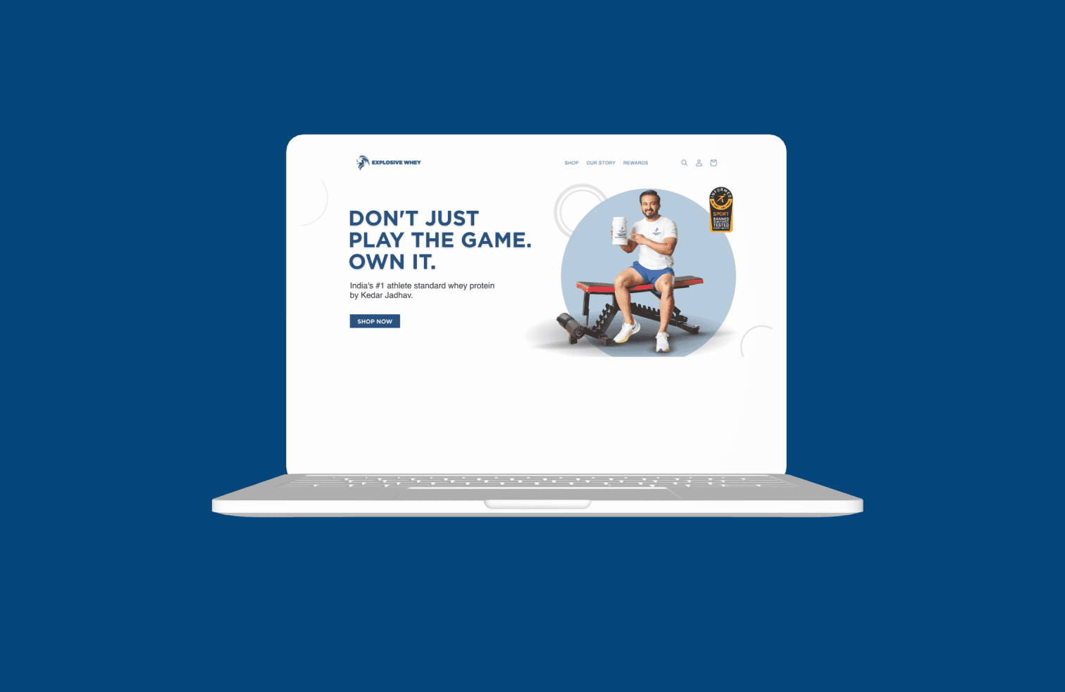
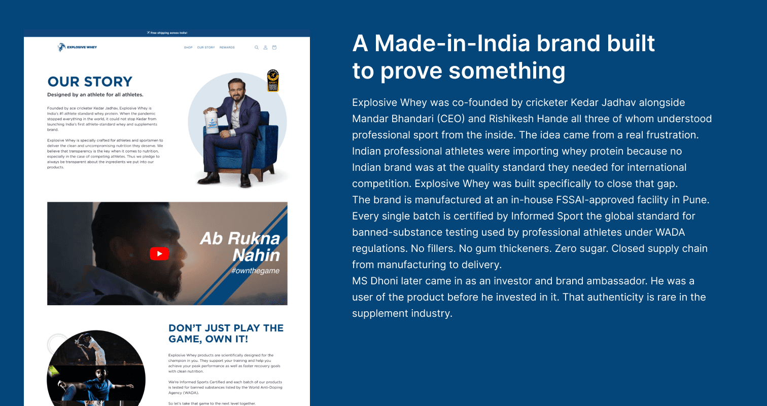
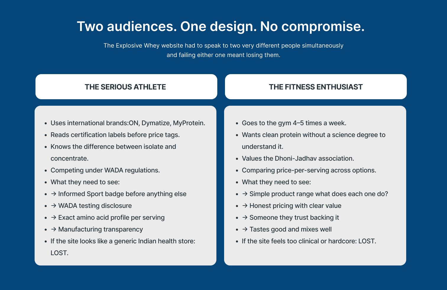
Explosive Whey is a Made-in-India sports nutrition brand co-founded by cricketer Kedar Jadhav alongside Mandar Bhandari and Rishikesh Hande, with MS Dhoni later joining as investor and brand ambassador a detail worth noting because Dhoni was a user of the product before he invested in it. That kind of authenticity is genuinely rare in the supplement industry. The brand was built around a real problem: Indian professional athletes were importing their whey protein because no Indian brand met the quality standard required for international competition under WADA regulations. Explosive Whey was built specifically to close that gap. Products are manufactured at an in-house FSSAI-approved facility in Pune, with every single batch certified by Informed Sport the global standard for banned-substance testing that professional athletes stake their careers on. No fillers, no gum thickeners, zero sugar, closed supply chain from manufacturing to delivery. The design challenge was a direct consequence of this backstory: how do you build a website that earns the trust of a serious Indian athlete who has been importing international brands, while staying accessible to the broader fitness enthusiast who just wants clean, quality protein? Getting both right in one visual language without losing either audience — was the brief.
Explosive Whey is a Made-in-India sports nutrition brand co-founded by cricketer Kedar Jadhav alongside Mandar Bhandari and Rishikesh Hande, with MS Dhoni later joining as investor and brand ambassador a detail worth noting because Dhoni was a user of the product before he invested in it. That kind of authenticity is genuinely rare in the supplement industry. The brand was built around a real problem: Indian professional athletes were importing their whey protein because no Indian brand met the quality standard required for international competition under WADA regulations. Explosive Whey was built specifically to close that gap. Products are manufactured at an in-house FSSAI-approved facility in Pune, with every single batch certified by Informed Sport the global standard for banned-substance testing that professional athletes stake their careers on. No fillers, no gum thickeners, zero sugar, closed supply chain from manufacturing to delivery. The design challenge was a direct consequence of this backstory: how do you build a website that earns the trust of a serious Indian athlete who has been importing international brands, while staying accessible to the broader fitness enthusiast who just wants clean, quality protein? Getting both right in one visual language without losing either audience — was the brief.

[3]
What I did
The visual language is dark and high-contrast black as the dominant background with the brand's electric orange as the primary accent, which is the same colour used on the product packaging. This was not a stylistic preference; it was a brand coherence decision. When someone has a jar of Explosive Whey on their desk, the website and the product need to feel like they belong to the same world. The hero section leads with the Dhoni-Jadhav association prominently not as a small endorsement badge but as a primary visual element because that association is doing significant trust work before a single product claim is made. The certification strip was placed before any product is shown: Informed Sport certified, WADA compliant, FSSAI approved, sugar-free, no gum thickeners, no fillers. A serious athlete scanning the page sees these before they see a price. That placement is an information architecture decision, not a design flourish it answers the unspoken question a sceptical buyer is already asking before they have a chance to leave. A dedicated manufacturing transparency section shows the Pune facility and the closed supply chain, specifically for the buyer who has been burned by adulterated supplements and needs to see how the product is made before they will consider purchasing. The personalisation feature customers can add their name or team name to the jar received its own visual callout because it is a genuine category differentiator that no other Indian supplement brand was offering.
The visual language is dark and high-contrast black as the dominant background with the brand's electric orange as the primary accent, which is the same colour used on the product packaging. This was not a stylistic preference; it was a brand coherence decision. When someone has a jar of Explosive Whey on their desk, the website and the product need to feel like they belong to the same world. The hero section leads with the Dhoni-Jadhav association prominently not as a small endorsement badge but as a primary visual element because that association is doing significant trust work before a single product claim is made. The certification strip was placed before any product is shown: Informed Sport certified, WADA compliant, FSSAI approved, sugar-free, no gum thickeners, no fillers. A serious athlete scanning the page sees these before they see a price. That placement is an information architecture decision, not a design flourish it answers the unspoken question a sceptical buyer is already asking before they have a chance to leave. A dedicated manufacturing transparency section shows the Pune facility and the closed supply chain, specifically for the buyer who has been burned by adulterated supplements and needs to see how the product is made before they will consider purchasing. The personalisation feature customers can add their name or team name to the jar received its own visual callout because it is a genuine category differentiator that no other Indian supplement brand was offering.

[4]
More projects
Explore other projects
CLIENT
PROJECT TYPE
INDUSTRY
YEAR
Healthcare Exam Platform
UX/UI Case Study
Healthcare · Education
2023
Healthcare Exam Platform
UX/UI Case Study
2023
Healthcare Exam Platform
2023
FreshCart
UX/UI Case Study
eCommerce · Grocery
2023
FreshCart
UX/UI Case Study
2023
FreshCart
2023
PolicySafe
Mobile App Design
Insurance · FinTech
2023
PolicySafe
Mobile App Design
2023
PolicySafe
2023
DeepCore Marine
B2B Website Design
Marine · Offshore Services
2025
DeepCore Marine
B2B Website Design
2025
DeepCore Marine
2025
Anovate
SaaS Landing Page UI
B2B · SaaS · Workflow Automation
2024
Anovate
SaaS Landing Page UI
2024
Anovate
2024
Pandit Chai
Website Redesign
Food & Beverage
2025
Pandit Chai
Website Redesign
2025
Pandit Chai
2025
Bend Soap Co.
eCommerce Redesign
D2C · Skincare
2024
Bend Soap Co.
eCommerce Redesign
2024
Bend Soap Co.
2024