MENU
CLOSE
[1]
Project
DeepCore Marine
[2]
Client
DeepCore Marine
Project type
B2B Website Design
Industry
Marine · Offshore Services
Year
2025
About project
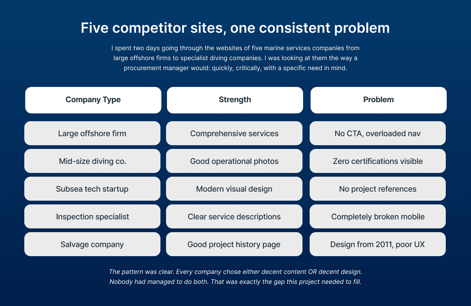
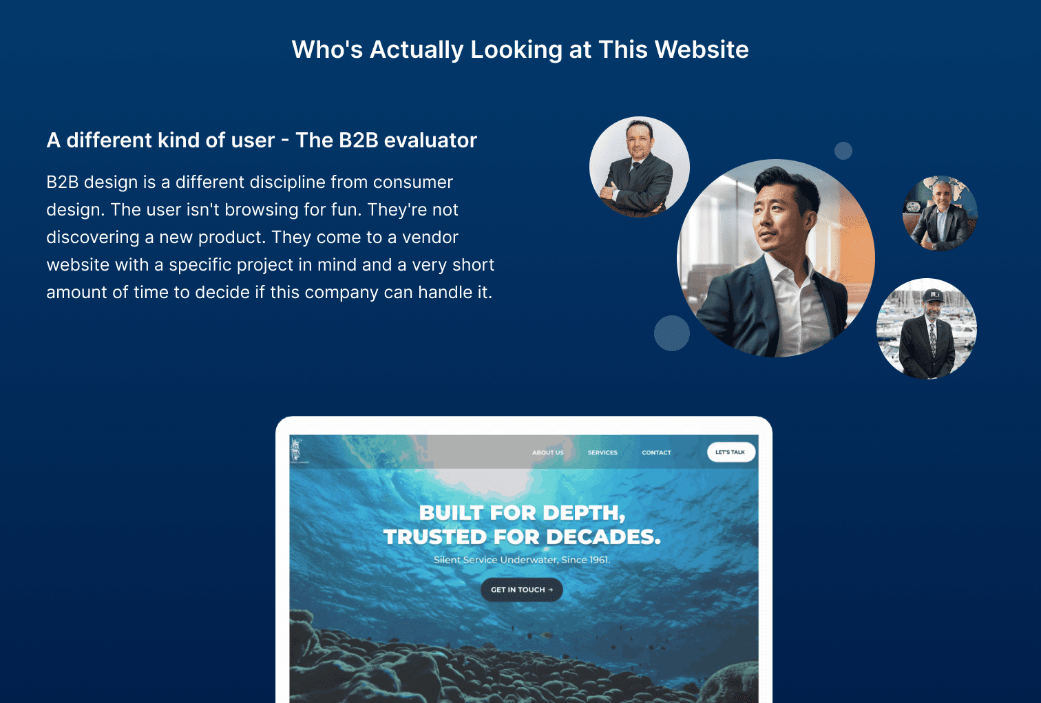
DeepCore Marine is a B2B website concept for a deep-sea marine services company offering subsea inspection, offshore diving, and engineering consultancy to clients in the oil, gas, and shipping industries. I chose this domain deliberately because it pushed me into a completely different kind of UX challenge. The users are not casual browsers they are procurement managers and operations directors making vendor decisions for multi-crore contracts, and their tolerance for a confusing or unimpressive website is essentially zero. Before opening Figma, I spent two days studying five real marine services company websites. The pattern was consistent across every single one: they all had either decent content or decent design. Not a single company had managed both. Some had comprehensive service information buried in navigation structures that made no sense. Others had modern visuals with zero credibility signals no certifications visible, no project references, no indication of actual scale or experience. The buyer visiting these sites is making a shortlist decision in under five minutes, and every competitor was making that decision harder than it needed to be. That gap extremely high-stakes buyers, extremely low-quality web presence across the board was the design opportunity.
DeepCore Marine is a B2B website concept for a deep-sea marine services company offering subsea inspection, offshore diving, and engineering consultancy to clients in the oil, gas, and shipping industries. I chose this domain deliberately because it pushed me into a completely different kind of UX challenge. The users are not casual browsers they are procurement managers and operations directors making vendor decisions for multi-crore contracts, and their tolerance for a confusing or unimpressive website is essentially zero. Before opening Figma, I spent two days studying five real marine services company websites. The pattern was consistent across every single one: they all had either decent content or decent design. Not a single company had managed both. Some had comprehensive service information buried in navigation structures that made no sense. Others had modern visuals with zero credibility signals no certifications visible, no project references, no indication of actual scale or experience. The buyer visiting these sites is making a shortlist decision in under five minutes, and every competitor was making that decision harder than it needed to be. That gap extremely high-stakes buyers, extremely low-quality web presence across the board was the design opportunity.

[3]
What I did
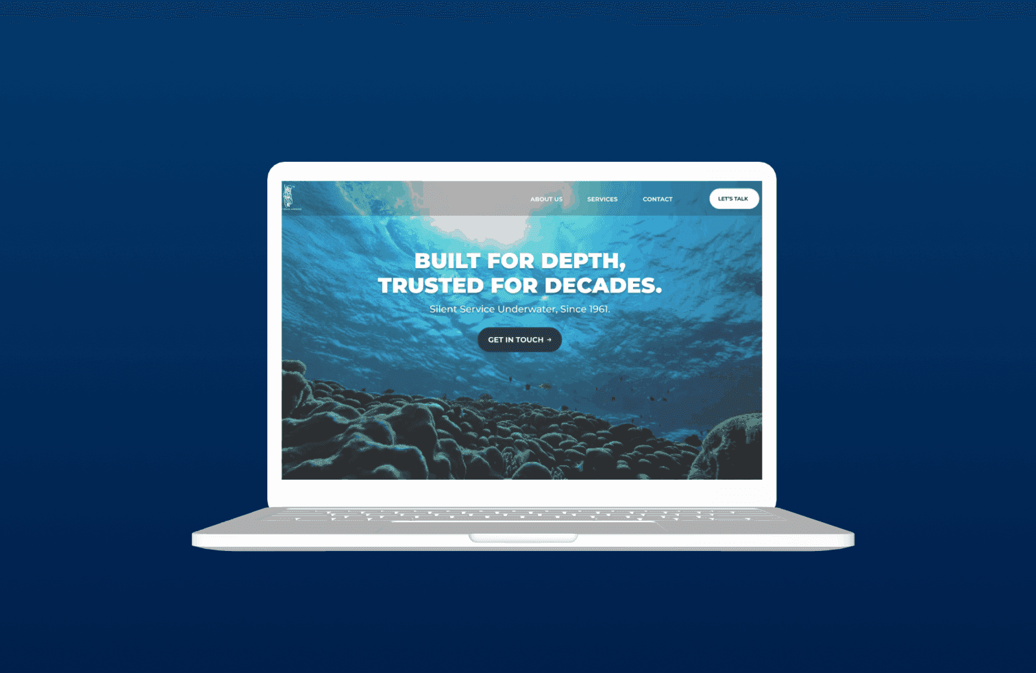
Before any visual work, I restructured the information architecture which turned out to be the highest-impact decision in the entire project. The original industry standard is ten or more navigation items with no logical grouping. I reduced this to five pages, each answering one specific question in a procurement manager's evaluation process: Home answers who are you, Services answers what can you do, Projects answers have you done this before, About answers should I trust you, and Contact answers how do I reach you. That sequence mirrors the actual journey a buyer takes. The navigation now mirrors it exactly. The visual system was built around one concept depth and precision. Deep navy as the dominant background communicates the ocean environment, authority, and the seriousness of the industry. Electric teal as the accent brings modernity without breaking the professional tone. No competitor in the space was using anything like this everyone defaulted to generic blue-corporate. Trust signals were placed on the homepage scroll path rather than the About page, because a procurement manager who has not been given a reason to stay on the homepage is not going to click through to the About page. Years in operation, project count, ISO and IMCA certification badges all visible before the first scroll. The contact form was reduced to four fields with a response-within-four-hours promise next to the CTA, because that promise removes the hesitation of not knowing what happens after you click send.
Before any visual work, I restructured the information architecture which turned out to be the highest-impact decision in the entire project. The original industry standard is ten or more navigation items with no logical grouping. I reduced this to five pages, each answering one specific question in a procurement manager's evaluation process: Home answers who are you, Services answers what can you do, Projects answers have you done this before, About answers should I trust you, and Contact answers how do I reach you. That sequence mirrors the actual journey a buyer takes. The navigation now mirrors it exactly. The visual system was built around one concept depth and precision. Deep navy as the dominant background communicates the ocean environment, authority, and the seriousness of the industry. Electric teal as the accent brings modernity without breaking the professional tone. No competitor in the space was using anything like this everyone defaulted to generic blue-corporate. Trust signals were placed on the homepage scroll path rather than the About page, because a procurement manager who has not been given a reason to stay on the homepage is not going to click through to the About page. Years in operation, project count, ISO and IMCA certification badges all visible before the first scroll. The contact form was reduced to four fields with a response-within-four-hours promise next to the CTA, because that promise removes the hesitation of not knowing what happens after you click send.

[4]
More projects
Explore other projects
CLIENT
PROJECT TYPE
INDUSTRY
YEAR
Healthcare Exam Platform
UX/UI Case Study
Healthcare · Education
2023
Healthcare Exam Platform
UX/UI Case Study
2023
Healthcare Exam Platform
2023
FreshCart
UX/UI Case Study
eCommerce · Grocery
2023
FreshCart
UX/UI Case Study
2023
FreshCart
2023
PolicySafe
Mobile App Design
Insurance · FinTech
2023
PolicySafe
Mobile App Design
2023
PolicySafe
2023
Explosive Whey
eCommerce Website Design
Sports Nutrition · D2C
2022
Explosive Whey
eCommerce Website Design
2022
Explosive Whey
2022
Anovate
SaaS Landing Page UI
B2B · SaaS · Workflow Automation
2024
Anovate
SaaS Landing Page UI
2024
Anovate
2024
Pandit Chai
Website Redesign
Food & Beverage
2025
Pandit Chai
Website Redesign
2025
Pandit Chai
2025
Bend Soap Co.
eCommerce Redesign
D2C · Skincare
2024
Bend Soap Co.
eCommerce Redesign
2024
Bend Soap Co.
2024