MENU
CLOSE
[1]
Project
Bend Soap Co.

[2]
Client
Bend Soap Co.
Project type
eCommerce Redesign
Industry
D2C · Skincare
Year
2024
About project
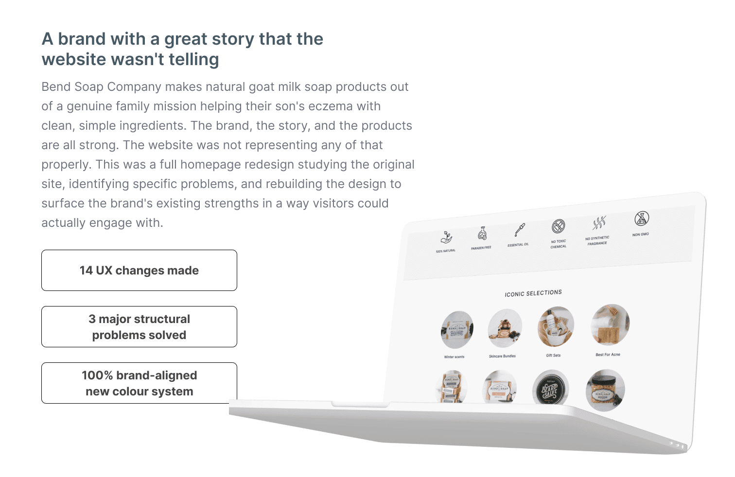
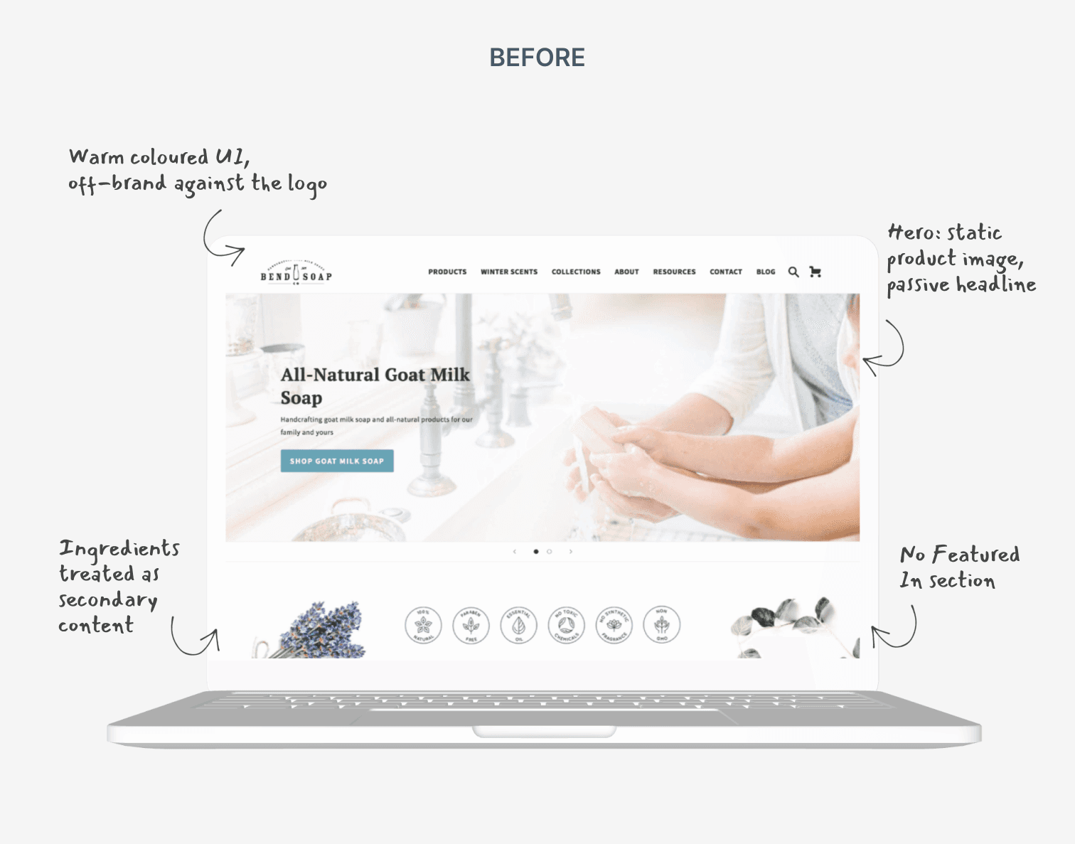
Bend Soap Company is a US-based natural skincare brand built around goat milk soap products. The origin story is one of the most compelling in the D2C skincare space a family searching for a solution to their son's severe eczema, working through dermatologists and chemical treatments that did not help, before discovering that handcrafted goat milk soap made from clean, simple ingredients was what actually worked. That story real ingredients, visible transformation, a family mission is one of the most powerful conversion assets any skincare brand can have. The brand had it. The website was not using it. The original site was a decent Shopify implementation with warmth but it had significant structural problems that were quietly hurting the shopping experience: a passive hero that positioned the brand only on price, an ingredients section that existed but was treated as secondary content rather than a primary trust-builder, no Featured In section despite the brand having appeared in Inc., Good Housekeeping, Yahoo, BuzzFeed, and The Bulletin, testimonials with no visual evidence of results, and a checkout with unnecessary steps and no guest-first path. The redesign's job was to take every asset the brand already had and move it to where it could actually do its job.
Bend Soap Company is a US-based natural skincare brand built around goat milk soap products. The origin story is one of the most compelling in the D2C skincare space a family searching for a solution to their son's severe eczema, working through dermatologists and chemical treatments that did not help, before discovering that handcrafted goat milk soap made from clean, simple ingredients was what actually worked. That story real ingredients, visible transformation, a family mission is one of the most powerful conversion assets any skincare brand can have. The brand had it. The website was not using it. The original site was a decent Shopify implementation with warmth but it had significant structural problems that were quietly hurting the shopping experience: a passive hero that positioned the brand only on price, an ingredients section that existed but was treated as secondary content rather than a primary trust-builder, no Featured In section despite the brand having appeared in Inc., Good Housekeeping, Yahoo, BuzzFeed, and The Bulletin, testimonials with no visual evidence of results, and a checkout with unnecessary steps and no guest-first path. The redesign's job was to take every asset the brand already had and move it to where it could actually do its job.

[3]
What I did
The most significant visual decision in this redesign was the shift to a clean black-and-white UI system. The original site used warm teal CTAs, botanical illustrations, and earthy background tones that felt homely but did not match the brand's own logo, which is a clean monochrome mark. That mismatch was creating a subtle inconsistency that eroded the sense of a coherent brand. The redesign resolves this by making all UI elements navigation, CTAs, section backgrounds, icons black and white, and letting the product photography carry all the warmth and colour. Fourteen specific changes were made across the homepage. The hero was upgraded from a static product image to an interactive video background that communicates the brand story immediately. The ingredients section was redesigned with generous white space and linear icons six key ingredients made visual, prominent, and scannable, because natural skincare buyers read ingredient labels and this section needs to reward that attention. A Featured In strip was added near the top of the page showing Inc., Good Housekeeping, Yahoo, BuzzFeed, and The Bulletin third-party credibility of that quality belongs in the first scroll, not absent from the homepage entirely. The testimonials section was rebuilt with before-and-after user photographs showing real eczema results, because text reviews tell you something worked but photographs show you. Checkout was streamlined — three unnecessary fields removed, guest checkout made primary, estimated delivery date shown at cart stage. Fourteen changes, each addressing one specific problem that was either hurting the experience or leaving a conversion opportunity unused.
The most significant visual decision in this redesign was the shift to a clean black-and-white UI system. The original site used warm teal CTAs, botanical illustrations, and earthy background tones that felt homely but did not match the brand's own logo, which is a clean monochrome mark. That mismatch was creating a subtle inconsistency that eroded the sense of a coherent brand. The redesign resolves this by making all UI elements navigation, CTAs, section backgrounds, icons black and white, and letting the product photography carry all the warmth and colour. Fourteen specific changes were made across the homepage. The hero was upgraded from a static product image to an interactive video background that communicates the brand story immediately. The ingredients section was redesigned with generous white space and linear icons six key ingredients made visual, prominent, and scannable, because natural skincare buyers read ingredient labels and this section needs to reward that attention. A Featured In strip was added near the top of the page showing Inc., Good Housekeeping, Yahoo, BuzzFeed, and The Bulletin third-party credibility of that quality belongs in the first scroll, not absent from the homepage entirely. The testimonials section was rebuilt with before-and-after user photographs showing real eczema results, because text reviews tell you something worked but photographs show you. Checkout was streamlined — three unnecessary fields removed, guest checkout made primary, estimated delivery date shown at cart stage. Fourteen changes, each addressing one specific problem that was either hurting the experience or leaving a conversion opportunity unused.

[4]
More projects
Explore other projects
CLIENT
PROJECT TYPE
INDUSTRY
YEAR
Healthcare Exam Platform
UX/UI Case Study
Healthcare · Education
2023
Healthcare Exam Platform
UX/UI Case Study
2023
Healthcare Exam Platform
2023
FreshCart
UX/UI Case Study
eCommerce · Grocery
2023
FreshCart
UX/UI Case Study
2023
FreshCart
2023
PolicySafe
Mobile App Design
Insurance · FinTech
2023
PolicySafe
Mobile App Design
2023
PolicySafe
2023
DeepCore Marine
B2B Website Design
Marine · Offshore Services
2025
DeepCore Marine
B2B Website Design
2025
DeepCore Marine
2025
Explosive Whey
eCommerce Website Design
Sports Nutrition · D2C
2022
Explosive Whey
eCommerce Website Design
2022
Explosive Whey
2022
Anovate
SaaS Landing Page UI
B2B · SaaS · Workflow Automation
2024
Anovate
SaaS Landing Page UI
2024
Anovate
2024
Pandit Chai
Website Redesign
Food & Beverage
2025
Pandit Chai
Website Redesign
2025
Pandit Chai
2025